New Niterra logo unveiled
Published

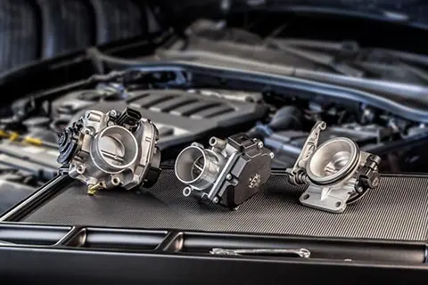
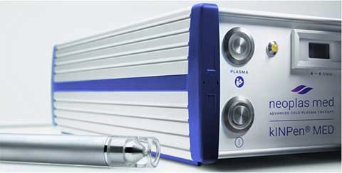
At the beginning of this decade, NGK SPARK PLUG released both its 2040 Vision, ‘Beyond ceramics, eXceeding imagination’ and its 2030 Long-Term Management Plan, ‘NITTOKU BX’. Both set out plans for the company to change drastically beyond the current way in order to secure its continued success well into the future. In the coming years, the company will transform its portfolio in more sustainability-driven directions. To this end, four new business fields have been identified – Mobility, Medical, Environment & Energy and Communications.
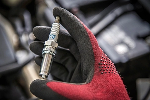
Against the backdrop of a rapidly changing automotive industry, which is expected to see a major decline in the use of the internal combustion engine (ICE), the company has concluded that the name NGK SPARK PLUG no longer accurately represents what the overall business stands for. Indeed, particularly in Europe and the English-speaking countries, the name is strongly associated with the ICE segment. This name, moreover, can result in the overlooking of the positive contribution which the company already makes to the environment – especially with its various ranges of sensors, its technical ceramics business and its many new fields of activities.
To mark this important milestone, both a new name and logo have been unveiled. ‘Niterra’ is a coined word, which combines the Latin words ‘niteo’ meaning ‘shine’ and ‘terra/earth’. It expresses the desire to be a company that not only contributes to a sustainable society, but also one that makes the earth shine: a goal formulated in the company’s 2040 Vision.
For the new logo, the colours ‘Earth Green’ for the letters used in ‘Niterra’ and ‘Shine Yellow’ for the dot on the letter ‘i’ have been selected. ‘Earth Green’ was chosen because it creates the impression of the Earth being seen from space. It, moreover, is a colour that evokes a sense of tradition and trust. ‘Shine Yellow’, in addition, is used in order to resemble the image of a candle shining like a torch.
“With our new Group and Corporate Logo, we are one step further on our transformation journey,” says Damien Germès, President & CEO of NGK SPARK PLUG EUROPE GmbH, Regional President EMEA and Corporate Officer of the Global Headquarters in Japan. “Our new corporate name and logo will be great symbols of our path towards developing the sustainable solutions of tomorrow.”
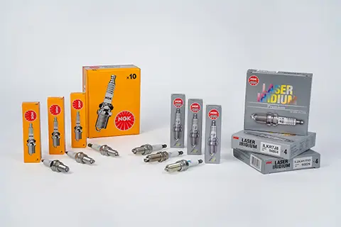
While ‘Niterra’ will become the Group’s overall name, the iconic brands – NGK and NTK – will continue to exist for the company’s respective ignition and sensor businesses.
Find answers to frequently asked questions about Niterra!
 Niterra Press Releases
NGK Ignition Parts expands spark plug portfolio to increase coverage in motorcycle and specialised applications
Read moreLatest Articles
NGK Ignition Parts powers up spark plug range: 26 new products for ICE and hybrid cars, from Porsche to Dacia - May 2026
NGK Ignition Parts extends ignition coils range with fourteen new references - April 2026
AHEAD’s loyalty programme propoints expands with addition of products from ElringKlinger and Nissens Automotive - February 2026